Kategorien durchsuchen
Entdecken
Fiverr Pro
Deutsch
$
USD

Turning Raw Data Into Clear, Actionable Visuals with Python
Kompetenzen
Meine Dienstleistungen

Data Analysis and Visualization Projects
Air University • Selbstständig
Sep 2025 - Present • 11 mos
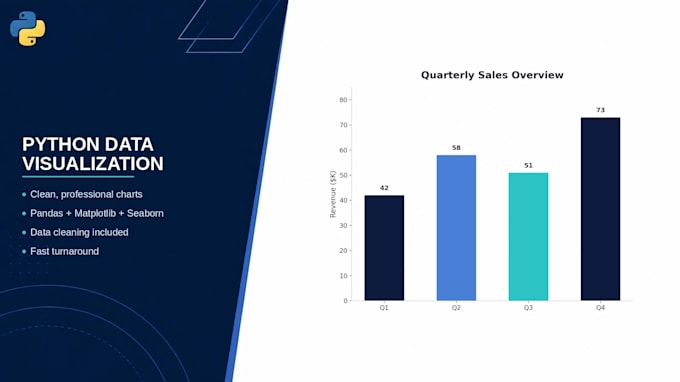
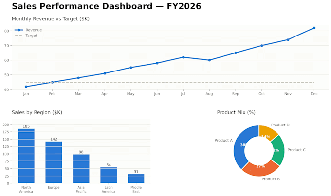
Completed a series of academic data analysis projects using public datasets (Kaggle, UCI, and others). Cleaned and processed raw data using Pandas, then built visualizations — including bar charts, line graphs, scatter plots, pie charts, histograms, and heatmaps — using Matplotlib to surface trends and relationships in the data. Analyzed patterns such as [name one real example if you have one, e.g., "survival rates across passenger demographics" or "correlations between study habits and academic performance"] and communicated findings through clear, documented reports. What changed and why: Cut "practiced" and "as part of coursework" from the closing line — the category label already signals it's academic, so the description itself can sound like a completed capability rather than an exercise. Fixed the inconsistent capitalization (Scatter plot → scatter plots, etc.) to match the rest of the list. Added a bracketed spot for one concrete example, since a real finding (even one) does more to prove capability than a tool list — same principle that made your Customer Segmentation portfolio piece the strongest.
